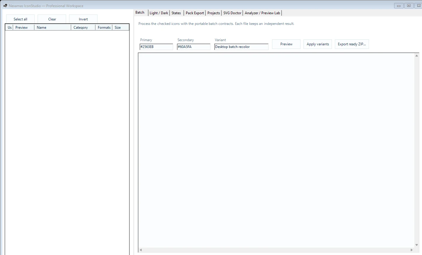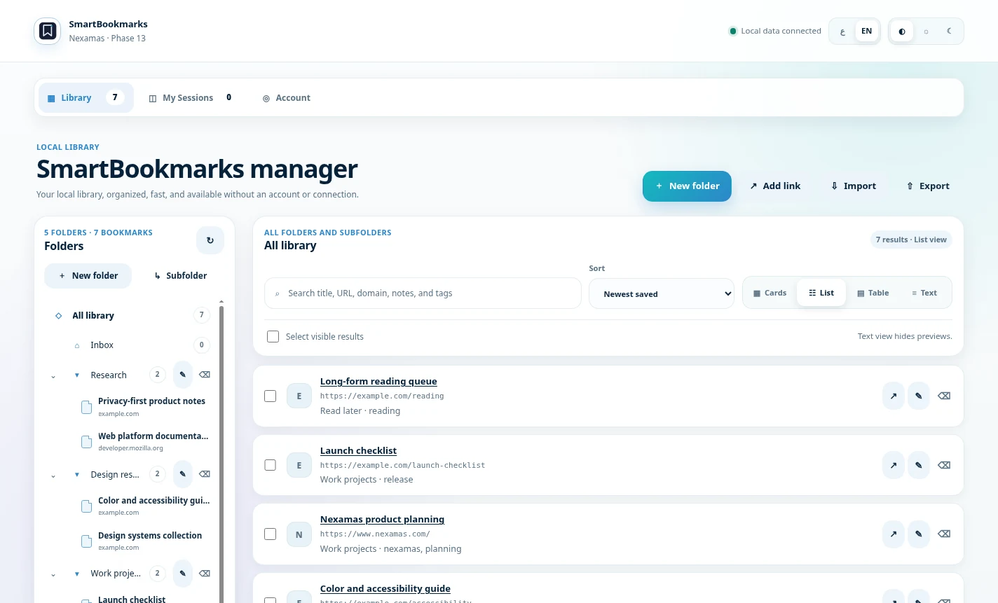
Nexamas UI · Early access

Modern Windows UI.Without starting over.

A commercial UI framework for polished desktop applications built with WinForms and .NET Framework 4.8.

Bring refined controls, advanced data surfaces, responsive layouts, themes, materials, RTL, diagnostics, and application-level infrastructure into existing Windows products.

Windows desktopWinForms.NET Framework 4.8Commercial early access
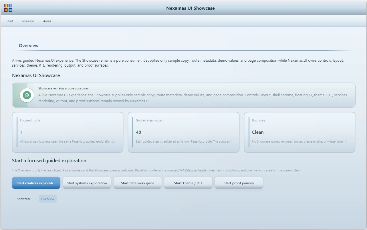
Nexamas UI Showcase
Nexamas UI overview
PASSFinal acceptance
100–150%DPI validation
Built for serious desktop softwareApplication infrastructure, controls, layouts, and data-heavy business screens.
International-ready experiencesRTL, localization, and clear interaction flows for global Windows applications.
Controlled commercial deliveryEvaluation builds, packages, and source access are provided directly on request.
Product capabilities

More than a control collection.

Nexamas UI is designed as a coherent desktop application system. Visual polish, behavior, structure, and validation are built to work together.

Controls & inputs

Consistent buttons, fields, selectors, calendars, notifications, and interactive feedback surfaces.

Data & analytics

DataGrid, dashboard cards, charts, master-detail flows, and structured business views.

Themes & materials

Theme-aware rendering, surface materials, density choices, and application-wide presentation rules.

Workflow & navigation

Rails, transfer lists, structured journeys, shell behavior, and composed multi-step experiences.

DPI & rendering

Validated presentation across common Windows DPI scales with clear text and resilient layouts.

Diagnostics & proof

External consumer validation, package proof, route verification, and release-focused quality gates.

Product experience

See the system in focused groups.

Instead of presenting screenshots as an undifferentiated gallery, the product is explained through the capabilities each screen demonstrates.

Theme system

One application. Multiple visual identities.

Nexamas UI lets a desktop product switch between complete application themes while preserving layout, behavior, and interaction consistency. The theme system is designed as an application-level capability, not as a collection of isolated colors.

  • Application-wide theme selection from the shell.
  • Consistent control states, typography, and feedback.
  • Theme choices remain independent from page composition.
Nexamas UI theme selection
Theme selectionGreen Ocean, Premium Office, Dark Blue Night Sky
Nexamas UI material selection
Surface material libraryCrystal, glass, metal, media, mist, paper
Warm Paper surface material
Warm PaperA distinct surface treatment
Surface materials

Presentation can change without rewriting the interface.

The material layer allows the same control system to adopt different visual characters: crystal, frosted glass, graphite, media-oriented chrome, soft mist, or paper-inspired surfaces.

  • Materials complement themes instead of replacing them.
  • Visual depth and atmosphere can be changed centrally.
  • Desktop screens retain their structure and functional clarity.
Application system

A complete shell, not a disconnected widget demo.

The showcase demonstrates how forms, summaries, operations, navigation, and contextual surfaces can live inside a unified application structure. This is where Nexamas UI moves beyond standalone controls.

  • Structured pages and application-level composition.
  • Reusable shell patterns for serious desktop products.
  • Coherent spacing, hierarchy, and interaction language.
Nexamas UI application dashboard
Application overviewSummary cards, operations, and layout composition
Nexamas UI data grid
DataGridDense business data with desktop clarity
Nexamas UI analytics dashboard
Analytics boardKPIs, charts, and reporting surfaces
Data & analytics

Designed for the screens where business software becomes demanding.

Administrative, financial, operational, and internal tools often need to show large amounts of information without becoming visually exhausting. Nexamas UI combines dense data presentation with strong hierarchy.

  • Structured grids for data-heavy workflows.
  • Dashboard cards, legends, KPIs, and charts.
  • Consistent visual language between data and controls.
Workflow & navigation

Complex interaction can still feel understandable.

Transfer lists, navigation rails, journeys, and structured page groups help transform multi-step desktop processes into manageable flows. The goal is not only to look modern, but to reduce friction.

  • Clear movement between states and sections.
  • Navigation components built for real application shells.
  • Workflow surfaces that communicate progress and context.
Transfer list workflow
Transfer listMove and organize selected items
Navigation rail
Navigation railCompact application structure
Feedback and status states
Feedback systemProgress, status, messages, and validation
Feedback & system states

Every action should communicate what happened.

Progress, confirmations, warnings, errors, and operational states are treated as part of the product language. Nexamas UI provides consistent feedback patterns so users are not left guessing.

  • Unified positive, warning, and error states.
  • Progress and status surfaces for long-running actions.
  • Contextual messages that belong to the application design.
More surfaces

Additional focused capabilities.

These focused examples complete the picture without turning the page into a wall of screenshots.

Calendar controls
Calendar & date inputsSelection, range, and time-oriented desktop controls.
File DropZone
File DropZonePurpose-built file intake for desktop workflows.
Master detail
Master-detail compositionConnected panels and contextual editing.
Component properties
Component propertiesTheme, behavior, and presentation controls.
Agenda
Agenda & planningScheduled work presented in a calm, structured layout.
Application overview
Application compositionSummary, hierarchy, and reusable desktop surfaces.
Quality & proof

Commercial confidence before public release.

The product has been validated as an external consumer, across release packaging, public routes, documentation alignment, and real DPI scales.

PASSFinal acceptance
100% · 125% · 150%DPI validation
External consumerConsumption proof
Docs alignedPublic route coverage
Controlled access

Request the delivery that fits your evaluation.

Nexamas UI is currently available through direct contact so distribution, evaluation, licensing, and support can be handled deliberately.

  • Evaluation binaries: compiled DLL and evaluation builds are available on request.
  • Private NuGet delivery: a controlled package can be provided directly for qualified evaluations.
  • Source-code access: source licensing or source access can also be requested and is supplied under separate commercial terms.
  • Documentation and onboarding: technical material can accompany the requested delivery.

The local preview opens your email application. A secure hosted form will be connected before public launch.

Opening your email application…